Tuesday, April 25, 2006

Quiet Please!

Today's cartoon is another favorite of mine, Bill Hanna and Joe Barbera's Oscar winning short, QUIET PLEASE! (1945), featuring Tom & Jerry. 

Ray Patterson animates this whole opening scene from the cartoon. Like Rod Scribner, Patterson was more concerned with the acting abilities of his characters rather than making them look pretty. You can watch this bit silent and know that Spike is about a second away from murdering Tom. I think he's my personal favorite out of all of the Tom & Jerry animators.


Irv Spence is known for wildness, and was one of Tex Avery's best animators at Warners. He was particularly gifted for animating painful sequences, though not this scene in particular. It sure looks like it hurt when Jerry jabs Tom in the stomach, though!


Ken Muse was used similarly like Bob McKimson at Warners, as he usually was assigned more subtle scenes, like this one of Tom putting Spike to sleep on the Knock-Out Drops. He certainly constructed the characters the best. Actually, come to think of it, doesn't Tom look like an old tyme melodrama villain with those whiskers looking like a mustache? Snidley Whiplash anyone?


I can't say I'm a big fan of Ed Barge's animation though. It's much weaker than the other animators' work, particularly into the 1950s. He seemed more concerned with having the characters look decent without much acting or fluid movement. His work wasfunnier to see in the mid-40s, when it looked like Tom & Jerry were more Harman-Ising-ish than usual. He did everything in this clip, except for Tom running back into the room and startled by Spike's 'growling' (that's Spence again).


Muse picks up with Jerry lifting Spike's eyelid, until Tom does his trademark yell after being bashed on the foot. Spence handles Jerry lighting the dynamite to Spike rolling up his sleeves and running off screen to beat the stuffing out of Tom. Muse picks up again with the pulverized Tom till the iris out.


Lots of cartoons have been based around this theme of keeping quiet. But I think this take on the theme is leagues ahead of any of them. Tom & Jerry do everything the best.

Monday, April 24, 2006

Draftee Daffy

Bob Clampett's DRAFTEE DAFFY (1945) has always been at the top of my list of favorite cartoons. It should be on your's too.

Daffy goes through so many hilarious emotions in this film that it's startling. Daffy is at his most human in Clampett's shorts, because acting is one of the things he did best. Clampett's version of Daffy is by far my favorite.

Not too mention this short is funny as hell!

But like I said, brilliance, like this and what I think is the best word to describe Clampett's last dozen or so films, doesn't appeal to all people. I watched the premiere episode of The Bob Clampett Show((which was CN's best one, right up there with The Popeye Show) with my father, and DRAFTEE DAFFY was the first one shown. He didn't get into it much. All he said was, "God, Daffy's got a big house, doesn't he?" Something I didn't notice before! God, these Warner guys did it the best.

Anyway, here's a little lesson in identifying animators, though I do think Clampett's are the easiest ones to differentiate the various artists. 

Most of this first clip, with Daffy reading the newspaper and parading, is all Manny Gould. Gould is the king of wild arm gestures.

When Daffy salutes Gen. MacArthur, and the wild combat bit, it's Bob McKimson's work. Look at how solid and beautiful the animation is! It cuts back to Gould for the remaining bit of the clip.


When Daffy answers the phone, it's the unmistakeable Rod Scribner. His style could be described as 'silly putty'. He was more concerned with specific acting than making the character look pretty. That's why he's one of the best.

It cuts back to Gould when he hangs up. More of his unmistakable wild arm gestures with Daffy here, and putting his face right into the camera. The human emotion here is great, with Daffy suddenly realizing that he's screwed and breaking down into hysterics. Having “It Had to Be You” play on the soundtrack only increases the hilarity of Daffy's grief.

Daffy crawling up to the window ("Man... Draftboard... Letter... President!") is of course Scribner's work, as is the wild take.

Gould picks up again with Daffy barricading the door, running upstairs, and the bit with the window. I try to make the face Daffy does while running whenever possible. It's unfortunately becoming subconscious.


Basil Davidovich comes in with Daffy packing his suitcase. The drawing of Daffy in this scene in particular looks more like it belongs in one of Art Davis' shorts, which is why this is attributed to him.

Gould picks up again once Daffy rushes up the flight of stairs to him closing the closet door... 

Scribner handles the scene with Daffy telling the little man "He'll never catch me in a million years!" Then there's a hilarious shot by Gould of Daffy's eyes moving to one side of his face! I could watch that bit for hours!


Sribner handles Daffy's take, and Gould handles him slamming the door (I love how doors seemed to be organic in Clampett's shorts).

McKimson handles Daffy setting the bomb next to the man. Perfect flowing arm movements in every way.

When Daffy is back downstairs, and the man gives him back the explosive, it's Davidovich. Scribner animates the great bit with the little man's eyes following Daffy's flight and fall.

McKimson was always used by the directors to handle more subtler scenes, so it's befitting he does this bit with the little man consoling Daffy after the explosion.


Davidovich handles everything from Daffy slamming into the safe to launching himself on the rocket.

McKimson handles the ending with Daffy finding out that despite being in Hell, his own personal Hell is not over.


Ingenious cartoon from a genius. Nobody could've pulled this off but Clampett.

Sunday, April 23, 2006

Two Too Talky, One God-Awful

Tomorrow is Monday. I go back to class and work. I have to deal with repetitious daily life again.

So I am going to punish you, my loyal readers, by showing you three examples of Columbia's 1940s B/W output. Be thankful I'm taking my rage out in this way.

These first two are cited in Leonard Maltin's essential book, Of Mice & Magic, as being particularly talky. He is understating it. Barely anything happens in the first one until the last minute of the cartoon. It also proves there was a law that every studio had to do a 'mouse-bells-the-cat' film.

Jon Cooke says about the second short: "... Somebody could take that soundtrack and just make some new animation and it could be passed off for a Cartoon Cartoon. Just redesign everything so it looks like a Dexter's Lab rip-off." Pretty accurate if you ask me.

The third one is lame as hell. You'll get a kick out of the ending though. It was probably based on some sort of real event between Columbia's studio head and the animation department.

So here they are! Don't say I didn't warn you!


MASS MOUSE MEETING (1943)


GIDDY-YAPPING (1944)


TANGLED TRAVELS (1944)


I think you also may have noticed by now that the theme song used on these films (from 1942-1944) is one of the most irritating ones in theatrical animation history. LOUD AND OBNOXIOUS. How fitting they start off these cartoons!

Be nice to me this week and maybe I'll post a good Columbia short. Like one of the ones Bob Clampett wrote with the cat-that-looks-like-Sylvester-but-isn't-Sylvester!

Friz Vs. Clampett on Timing (Pt. 2)

Today's post compares two shorts of a similar nature... Both being musical Warner shorts from the same year, but by different directors and with different musical themes. They're PIGS IN A POLKA by Freleng (set to Brahmm's Hungarian Dances) and CORNY CONCERTO by Clampett (the first piece set to Johann Strauss'Tales from the Vienna Woods) , both from 1943.

Friz's timing was superb in his musicals. Every movement is synchronized perfectly with the soundtrack. I don't think any other musicals (WB or otherwise) got timing down as good as his, save the Swing Symphonies and Musical Minatures at Lantz, which are good contendors. Friz was the master of musical cartoons as far as I'm concerned.

I believe Gerry Chiniquy animated most of this scene, because the pigs tend to jerk from pose to pose, which allowed for quicker movement, and therefore easier to time with the music. The rest of the cartoon is just as great.


Clampett said in later years he was not happy with the timing in CORNY CONCERTO. I like the animation overall in this film better than PIGS IN A POLKA, and the timing is also quite decent. But for some reason it doesn't come off as 'perfection' in Clampett's short. Music tended to call for more 'refined' and polished timing, which doesn't seem to be Clampett's specialty (not that there's anything wrong with that!). For the record, I think the Deems Taylor FANTASIA parody is funnier in Clampett's than in Friz's.

Bob McKimson animated Elmer's entrance, and Rod Scribner picks up at the close-up of him. He handles the rest of the scene until Bugs pops out of his rabbit hole, which is then handled by Virgil Ross.


CORNY CONCERTO is great, sure, but it's nowhere near the top of my list of favorite Clampett shorts. Jon Cooke tells me that when he went to see Bugs Bunny on Broadway, this short got the least applause from an audience of all ages. HIGH NOTE didn't get much applause either so they weren't stupid. There is some great emotion and acting in this film... It just doesn't do it for me like a lot of Clampett's other superior films.

PIGS IN A POLKA, on the other hand, IS at the top of my list of Friz films, so I like his short better. I did notice something for the first time watching this cartoon... It suddenly turns into a ten-story house by the end of it! I love the lack of continuity... It's one of the things that makes animation great! Must be that great timing that made me forget about it all the other dozens of times I've seen this cartoon (as well as 'Concerto', both being public domain shorts).

Saturday, April 22, 2006

Friz Vs. Clampett on Timing (Pt. 1)

God bless Friz Freleng. He is in no way my all-time favorite director at Warner Bros. (a topic heavily debated recently, my personal favorite will always remain Jones, followed very closely by Clampett), but he was probably one of the most solid directors to ever work in the industry. Very, very few directors can be claimed to have consistency in delivering a well-done and overall enjoyable product for their entire career, and Friz is most certainly one of them.

What I think he did best, and this is why I admire his work, was timing. His sense of it was unique, because he knew HOW to deliver the punchline and to get the biggest laughs from all members of the audience. It's nowhere near as razor-sharp as Clampett's, whose timing I do prefer, but Clampett was brilliant as well, and brilliance doesn't appeal to all people.

Case in point. I have been to several unbiased (and unsupported by Warners) screenings. One I remember fondly was one of Reg Hartt's in Toronto. Only my father and I and a few others (two were a couple whose idea of a night at the movies was a six-pack of beer and watching Warner Bros. Cartoons... my kind of people!) were in attendance.

Reg played a lot of great ones, the best from all the directors. These other people, none of whom were very scholarly animation wise, laughed their asses off at I TAW A PUTTY TAT, HIGH DIVING HARE, RABBIT'S KIN, AWFUL ORPHAN, and BULLY FOR BUGS. I was amazed that not even the booze made them find brilliant shorts like THE GREAT PIGGY BANK ROBBERY, TIN PAN ALLEY CATS, or THE BIG SNOOZE remotely entertaining.

I think now is a good time to compare Friz's timing to Clampett's.

This first scene is from Clampett's first Tweety carton, A TALE OF TWO KITTIES. One I know everyone has seen due to its presence on endless amounts of public domain tapes. This scene exemplifies why I love Clampett. The timing is razor sharp, it's violent, funny, and is drawn hilariously.

Virgil Ross animated Babbit and Catstello in the opening part of this scene. Rev Chaney (another uncredited WB animator) picks up with the shot of Catstello being shot up in the air. Bob McKimson's perfect construction shows up as soon as Catstello finds Tweety in the nest (I love that expression of dopiness!). Rod Scribner picks up with the actual explosion.

Special thanks to Mark Mayerson for double-checking the actual draft of this thing.


Friz reworked this scene for one of his own Tweety pictures, BAD OL' PUTTY TAT, another short I'm sure everyone's seen. Tweety, by this time, has been toned down since the initial Clampett shorts, but he is still more aggressive than he would be in later pictures (when they turned him into what Clampett were making fun of originally). Virgil Ross animates Sylvester coming on screen with the equipment, Manny Perez handles the rest of the scene (thanks to Bart Kasper for helping me, I'm not familiar with Friz animators at all).


Despite the scenes actually having a similar running time, Friz's take on this gag removes all the edge off of it. The speed is also toned down to help the audience register what's going on. I'm honestly not sure which one would get more laughs from a general audience, as playing them in chronological order, or in the same block, would just make them think “Hey didn't we just SEE this cartoon?”

I personally think the gag is funnier in Clampett's short. But the rest of Friz's film is not without merit (I love the ending with Tweety ramming Sylvester into the brick wall). Friz will come off a lot better (though I personally think he came off OK here) when I compare two other Friz and Clampett shorts.

Friday, April 21, 2006

Snow White Pessimism

SNOW WHITE & THE SEVEN DWARFS is often regarded as one of the greatest films ever made. I've been meaning to watch this film again for some time to see if I feel the same way. I can't say I do.

This movie is in no way one of my favorites, Disney or otherwise, but there are still plenty of admirable traits. It was probably the most important thing the studio ever did and certainly was groundbreaking. I also liked the animation of the dwarfs, and the dramatic themes with the Queen.

But there was a lot I didn't like about the movie. I really, really don't like the boring realistic human animation. I think it really dates the feature as being a staple of 1930s animation (as well as Fleischer's GULLIVER'S TRAVELS), and it results in a very limited range of facial expressions and movement. That's one of the same problems I had with CINDERELLA too, where the title character, the Prince, and the Stepmother all look like they belong in a different movie, whereas all the other human characters in the movie are pretty funny looking and expressive. Cartoony humans are probably the reason why I like the characters in ALICE IN WONDERLAND and PETER PAN so much more.

One thing I couldn't help noticing throughout the movie is that it made me think of a lot of other films and cartoons. I guess you can account that to how influential it was on the entire film and animation industry.

I really hope I'm not the only other one who thought of Rod Scribner's fantastic animation from COAL BLACK & DE SEBBEN DWARFS and burst out laughing during the wishing well scene. And I hope you don't think of me as horrible for thinking Snow White's vocal abilities were on par with Jean Hagen's as 'Lina Lamont' in SINGIN' IN THE RAIN.


Only Bob Clampett could parody like this.


I also felt that a lot of the movie was extraneous, which is odd, because I never felt that way during PINOCCHIO, a slightly longer and much, much, much better film all around (if anything, that movie would have been better if it did have more). Parts like the dwarfs entering their house, and the washing and yodeling songs went on too long to hold my interest.

Keep in mind that this is the first time I've seen the movie in over 10 years. The last time I saw it was whenever it was last theatrically reissued, in 1993 I believe. Even back then the boring realistic animation was forever burnt in my brain.

I've had the DVD set since it came out in 2001 but have not watched it until now. Remember, that was 2001. Anything that fit in the description of 'classic cartoons' had to be bought, or at least asked for as a gift. All we had back then were overpriced singles of Disney features and crappy Cartoon Crazys discs.

I am not at all familiar with the movie's history, and am slightly interested in reading about it. Though the debating over the animation of Grim Natwick, Hamilton Luske, and Bill Tytla has admittedly bored me silly. If anyone has any good sources about the movie, please let me know.

Like I said, the movie was groundbreaking and very well-made, but that doesn't mean much 70 years later if it doesn't hold up as well. And for the record, so it's not as if I'm against early Disney features, I'll say it again, that I enjoyed Pinocchio about 100 times more than this one. And I liked Dumbo even more than that one!

Because nobody demanded it, here's another video I made at 2 in the morning. I promise the next entry will actually identify an animator.


Thursday, April 20, 2006

Fox & Crow Fun

The one studio I really want to like more than I do is that of Screen Gems/Columbia Pictures.

They were putting out some very nicely animated cartoons, with good music, and they had their best hits with the greatcharacters, the Fox and the Crow. The problem is, these cartoons have very, very weak writing.

PHONEY BALONEY (1945) is a perfect example. The opening to this thing sets it up for a manhunt for an escaped wolf convict. There are some nice sight gags with the police running around town looking for him and wanted posters of the wolf whistling at a girl fixing her stocking.

But then it goes in a completely different direction! Wanted posters are put up over the Fox and Crow's windows, and when they open them, they mistake each other for the wanted criminal with a $5 K reward on his head and spend the rest of the thing trying to capture each other. So the whole first two minutes of the cartoon was meaningless! And the Fox and Crow don't even run into the wolf at all! What lousy writing!

They could come up with a funny scene once in awhile, like this hilarious number from EGG YEGG (1944). This is the best part of this otherwise lackluster cartoon. Frank Graham was great as the Fox and the Crow. This series was also the only one that benefited from dialog. People say Chuck Jones invented the talky cartoon. They are wrong. Nobody shuts the hell up in these things. You can tell they have a real problem with it if even a master like Mel Blanc sounds obnoxious in their late 30s/early 40s shorts!


Speaking of Chuck, there is one cool aspect of this cartoon. Fauntleroy is an egg researcher trying to claim Crawford's two refugee eggs of an unknown species... It winds up with a backfiring attempt on Faunt's life, and Crawford getting shot out of a cannon to the Big Dipper. The emotions are everywhere in this and many other films, and not in a good way like Clampett's shorts.

But back to Chuck... A lot of Columbia's just have really damn weird endings, and this one is no exception... Look at what the eggs hatch out to be! Don't you think they look a lot like the Road Runner or even more so the Instant Martians from HAREWAY TO THE STARS (1958)?


As I said earlier, I really love the Fox and the Crow. It's just that the shorts barely realize the potential of them. The comics really do. Here's a few scenes from one that I do think realizes their potential. It's also one of the funniest.

MR. MOOCHER (1944)


I have no idea who animated these scenes. But I am interested in knowing, even though I can't really differentiate any styles, except some scenes are better looking than others. I'd love to get a draft from one of the Fox & Crows. E-mail me if you can get me one. I'll pay you plenty.

Wednesday, April 19, 2006

Marty Taras

I think that the Famous Studios output is pitifully underrated. While I know that the stories are very repetitive, I think they had some very good animation and decent characters (though admittedly, their potential was never fully realized), and are definitely a step above the Terrytoon output (which I also feel is very underrated, and will be posting about them in the future).

I think that the Famous Studios output is pitifully underrated. While I know that the stories are very repetitive, I think they had some very good animation and decent characters (though admittedly, their potential was never fully realized), and are definitely a step above the Terrytoon output (which I also feel is very underrated, and will be posting about them in the future).
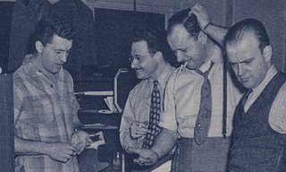
Famous Studios Staff

Left to Right: George Otino, Lou Zukor, Martin Taras (hand on head),
and Pete DeAngelo at Famous Studios in 1945.


Marty Taras is one of the great animators at Famous. I think he invented the 'stock cookie cutter' look that some criticize the shorts for, but I think it works really well for the dopey characters like Baby Huey and Katnip. There is also really fluid movement in his animation.

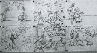
Quack-a-Doodle-Doo
Storyboards for Baby Huey's debut film, QUACK-A-DOODLE-DOO (1950).
Attributed to Carl Meyer.


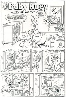
Speaking of Huey, Marty created this character! He was said to have been the model for his body-build too. Below is one of his great pages of comic book art from the early 50s. Jerry Beck was kind enough to send me all of these great images you see before you. Bob Jaques also helped me pinpoint a few of these Marty Taras scenes and his style. The three of us need to collaborate on a book of the Famous history, guys! It's really needed!

Huey Taras Art


Here are a few scenes that Marty animated during the 'formula-driven' days. I don't think he animated everything in the OF MICE & MAGIC (1953) clip, but he certainly did most of the closeups of the mice and Katnip. There's a lot of life and movement in these scenes. I guess I just like seeing the good in everything from the good old days.

SCOUT FELLOW (1951)


OF MICE & MAGIC (1953)


BETTER BAIT THAN NEVER (1953)


STARTING FROM HATCH (1953)


HAIR TODAY, GONE TOMORROW (1954)


I'll be posting more about New York animators (Fleischer and Terry too) in the future... That is, if you'd like to hear about them! Even if you don't, too bad! There's a lot of history that needs to be covered on the East Coast styles, which all histories and most websites are completely lacking of.

Edit: Michael Sporn has been posting several pieces of Famous artwork and a bit of history on Marty Taras at his wonderful splog. I highly recommend you check it out.

Saturday, April 15, 2006

Chuck Jones and Frank Tashlin

A lot of people claim that everyone at Warner Bros. emulated Clampett, but I don't think that's very accurate. I do think that a lot of Clampett's wild energy rubbed off onto the other directors, but if anyone is Chuck Jones' 'mentor', I'd have to say it's Frank Tashlin.

Most always cite Tashlin's THE FOX & GRAPES at Columbia inspiring the Road Runner series as an example, but it goes beyond that. Whenever Tashlin is mentioned, the writer always goes into how his use of different shots and angles is more like something that would be done in live-action. I think Jones wanted to emulate these techniques of Tashlin, and I honestly think his 'borrowing' of them was superior.

Here are a few examples from some of Jones' late 40s shorts (his best!) of different shots and angles that I think were inspired by Tashlin's work.


HAREDEVIL HARE (1948)
Haredevil Hare

FAST & FURRY-OUS (1949)
Fast & Furry-Ous

FOR SCENT-IMENTAL REASONS (1949)
For Scent-Imental Reasons


There is also, of course, this excellent scene from FRIGID HARE (1949), that was animated by Lloyd Vaughan. This may be the greatest chase scene ever put on film. Everything works in it. I feel Carl Stalling's score enhances the enjoyment of it as well.


How to Bastardize a Beloved Film by Yourself

All you really need is Windows Movie Maker, something that makes MPEG files, and a single funny cartoon sound effect.

I actually got around to watching BAMBI (1942) for the first time in God knows how long (all I know is is that the copy in our basement was still in its original wrapping!). I might post my thoughts on this film later on (though I'd rather rip SNOW WHITE a new one beforehand), but all I'll say is that I didn't laugh at all during the movie. Now I know it's completely wrong to think that a cartoon has to be funny to be good, but I always get at least one good laugh from the Disney features. But I didn't with this one.

So what better way to make sure there's a funny scene in Bambi than to make sure that it's one of the most traumatizing Disney moments?


I promise my next post won't be as silly. Blame Jon Cooke for inspiring me to make this if you think it's lame. Be thankful I don't show you the other things I come up with at 2 in the morning.

You can see a funnier Bambi parody here though.

Thursday, April 13, 2006

In Memory of Bill Grace

I won't get too much into my recently deceased uncle, Bill Grace (1943-2006), and his life story much here, except to tell you that he was a great and funny man. He was a particularly strong one too, often seen lifting refrigerators and other large appliances by himself for one of his eight siblings.

My only animation-related memory of him was one afternoon he was over at my house, and we watched one of Cartoon Network's Acme Hour blocks (you know, when they actually played cartoons years ago, let alone ones that didn't suck).

Friz Freleng's Tweety & Sylvester short MUZZLE TOUGH (1954; arguably the most groan-inducing title in cartoon history) was on, and I never heard a grown man laugh so hard at a cartoon in all my life. This same block had a few Tex Avery shorts as well, but his laughter at this one makes me think of him everytime I watch it.

In particular, it was this scene of Tweety leading Sylvester up the stairs with a grand piano that had him roaring... Obviously he could relate to having to carry something so massive!

I have no idea who animated this scene (except that Sylvester with the piano keys as teeth is definitley by Art Davis), but I think this clip preserves my own memories of Uncle Bill and his sense of humor very nicely.


Wednesday, April 12, 2006

Famous Popeye: John Gentilella

I think I may have possibly found one solid reason for why the Famous Studios output needs to be properly researched. And he is John Gentilella.

I don't know much about this man's life story, except that he animated for Van Beuren and Terry before his 12+ year tenure at Famous.

John Gentilella was responsible for a lot of the wonderful animation in the Famous Popeye the Sailor shorts. Rewatching these cartoons, knowing which scenes he did, I can safely say this man could hold his own to the best on the West Coast. The animation of Popeye, Bluto, and Olive Oyl in these scenes are wonderful, filled with life and feeling. John also seemed to have a knack for handling many of the fight sequences too, as he is a master of fluid movement.

Having to pull these clips from VHS recordings from the 1980s (some of them unfortunately time-compressed) reminds me of how badly we need these and the Fleischer Popeye films released on a proper collection. Maybe some day, but it's been over 20 years, so I can't see it ever happening anytime soon. These are from some of the best Popeye cartoons done at Famous and I think John is a strong reason they are so.

If anyone is wondering why Popeye's voice sounds screwy, that's because it's not Jack Mercer voicing him, as he was drafted in WWII. I'm uncertain to who's voicing Popeye in these clips.


THE ANVIL CHORUS GIRL (1944)


FOR BETTER OR NURSE (1945)


KLONDIKE CASANOVA (1946)


I owe a huge thank you to Bob Jaques for introducing me to Johnny Gent's style. He has been very generous with his time and knowledge in our discussions of New York animators. He helped me pinpoint another great, Marty Taras, who is going to be a highlight later on.

You'll have to rewatch the FOR BETTER OR NURSE clip again, because I reuploaded it with a little bit more, with Bluto saying "You runt! Now nobody goes to the hospital!" at the request of Bob. He said: "I love the way Bluto forces out the word “runt”. It’s an animation flourish that I feel separates the good from the great." I agree with him completely.

Monday, April 10, 2006

Odor-Able Kitty (Bob Cannon)

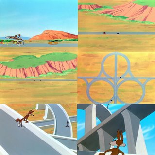
Pepe Le Pew was always my least favorite Warner character as a kid. It must be because the shorts are simply remakes of the excellent cartoon FOR SCENT-IMENTAL REASONS (1949)... That one won an Oscar, so I guess Chuck went with what worked I guess!

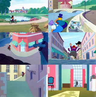
But the actual character Pepe Le Pew is quite a funny one, especially in the earliest shorts, like his debut film, ODOR-ABLE KITTY (1945). This one has some fantastic Bob Cannon animation in it. Bob was always great with facial expressions and movements. He animated the ending where it's revealed that Pepe is really henpecked 'Henery' with two kids, and the French accent is a fake! I think Ken Harris animated the cat sneaking away as Pepe is getting beaten by his wife. The cat is male, BTW... Talk about a couple who needs marriage counseling!